Introduction
As I endeavor to contribute to the positive transformation that web development offers the world, accessibility has become an important aspect of my journey. My interest in focusing on accessibility gained a new dimension with a simple yet a profound realization: One day, I envisioned what it would be like to interact with a webpage through listening rather than seeing. This was eye-opening! — experiencing the digital world via a screen reader unveils a completely different dimension for someone who relies on auditory information. I recognize that accessibility is not only about visual challenges; it encompasses a broad spectrum of considerations. In this post, I will discuss several straightforward yet impactful steps I've implemented to ensure my portfolio site's homepage adheres to accessibility standards.
Implementing Semantic HTML
Embracing semantic HTML through elements such as header, nav, main, section, article, and footer not only strengthens the structural integrity of a website, which is beneficial for readability among team members and for Search Engine Optimization (SEO), but also enhances its navigability and interpretation by screen readers. The term 'semantic' itself relates to "meaning," and what a semantic element does is convey to the browser or an assistive technology the type of content it contains. For instance, a nav element signifies content that is used for navigation.
This approach to markup provides a clear outline of the website's layout, facilitating a more intuitive and meaningful experience for users who rely on assistive technologies to interact with digital content. A div is what we'd call a non-semantic element, commonly used for styling purposes. Unlike semantic elements, divs do not inherently convey information about their content, which may reduce their effectiveness in accessible web design. However, divs can be enhanced with ARIA labels if necessary to provide additional context, hence improving their utility in accessibility contexts.
Enhancing Keyboard Navigation
I ensured that all interactive elements are fully operable through keyboard navigation by simply using HTML elements that are inherently focusable and accessible with the keyboard. Specifically, I used hyperlink anchor tags which are useful not just for linking to other pages, but also for in-page links that navigate to different sections of the current page. I also used the input tag and the textarea tag. Additionally, there were two more approaches for enhancing keyboard navigation that I'm going to address soon. One is subtle yet impactful and the other was a bit of a challenge and required some external testing.
Logical order of links
The navigation links on my homepage — About, Projects, Skills, Blog, and Contact — correspond to their respective sections. Ensuring these links are listed in the same order as the sections appear is important for consistency. This consistency allows users to anticipate the navigation sequence better, making the site easier to use and avoiding potential confusion.
Skip to Main Content
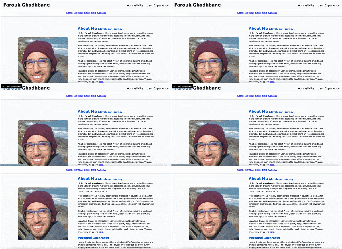
I found the concept of skipping to main content when it comes to screen readers really interesting. Simply put, an anchor tag with a target href, say for instance a main tag with an id, is placed as the first child of the body element. It is styled in a way that makes it hidden until it gets focused on using the keyboard. Once the user hits enter, the focus would skip the header and navigation elements and jump straight to main element.
Skipping content doesn't have to be done over the header and the navigation. It can also be reused within the same pge. What's important to consider though is tailoring its usage to whatever serves best the user in question. The importance of this implementation is giving the user the option to jump straight to the main content instead of having to go through all the headlines and navigation items which can feel tedious and time consuming. Here is the skip-to-main-content link in action:

Hitting tab, once the page loads, brings out the skip-to-main link to full view on the top left corner of the page and focuses the keyboard on it. Hitting enter, which signals that we want to skip content, moves the focus to the main content of the page disregarding the header and the navigation bar.
A funny mistake
In order to make sure my skip-to-main-content feature was functional. I needed to test it. I set it up initially with an href of "#maincontent" at the top of my body tag and thought I was good to go. Lo and Behold, I was not! A skip link, surely skips over something, but it's skipping to something else I didn't establish a connection to! WAVE helped me see that.
Testing with WAVE
WAVE is a web accessibility evaluation tool developed by WebAIM.org (Web accessibility In Mind), an organization dedicated to making web content more accessible to all people, regardless of disability. WAVE, offered as a free extension for the Chrome Browser, audits a web page for accessibility issues paying attention to aspects like color contrast errors and ARIA labels. When I tested my webpage using WAVE, I found an error saying "A skip navigation link exists, but the target for the link does not exist or the link is not keyboard accessible." What that means is that I had to assign an id of "maincontent" to my main tag to make sure the href of "#maincontent" links properly to the main element.
Color Contrast
Ensuring that text is easily readable by users with visual challenges is a critical aspect of web accessibility. To address this, I have implemented robust color contrast ratios across my homepage that exceed the minimum requirements set by the Web Content Accessibility Guidelines (WCAG) 2.2, the latest version as per the writing of this blog post. You can find out more about the latest accessability guidelines by visiting the official WCAG 2.2 documentation on the W3C website.
ARIA Labels
ARIA, which stands for Accessible Rich Internet Applications, is a set of attributes you can add to HTML elements. These attributes do not affect how elements look or behave in browsers for users without disabilities; instead, they interact with accessibility tools like screen readers to improve the user experience for those who rely on such technologies.
ARIA labels, specifically, offer ways to attach descriptions directly to interactive elements, enhancing the accessibility of non-text content. For my page I had a link on a webpage that uses a GitHub icon instead of text. Visually, the icon conveys that the link leads to a GitHub page, but without accompanying text, screen readers may not be able to communicate the link's purpose to users with visual challenges. In such cases, an ARIA label can be crucial.
After I applied an aria-label attribute to the anchor element, the link became accessible to screen reader users. This ARIA label clearly describes the link's destination and function, which ensures that all users, regardless of their visual capabilities, can understand the link's purpose.
Actual Implementation on my Homepage
  <a href="https://github.com/FaroukGhodhbane" aria-label="View my Github account">
    <i class="fa-brands fa-github" /i>
  </a>
Confirming with ChromeVox
ChromeVox is a web based screen reader offered as a free extension for the Chrome browser. In order to make sure the screen reader would pick up my github link, I needed to navigate to it using the keyboard and pay attention to what it says. Guess what? It said "View my Github account." Yay! It read exactly what I wrote as an ARIA label.
Enhancing Form Accessibility with Labels
Properly associating label elements with form controls using the for attribute and corresponding ids is another approach I took for making my homepage more accessible.
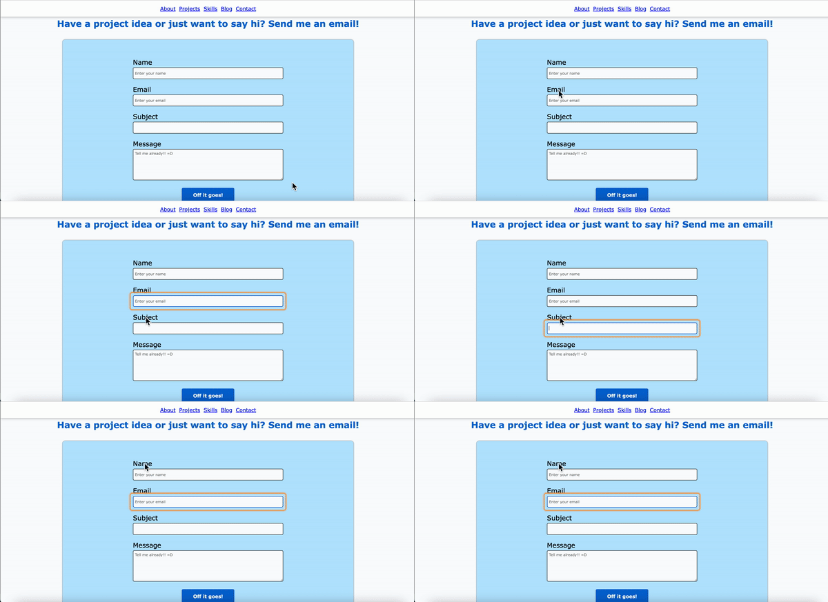
Turns out, when a label is connected to an input element, clicking on the label text will place the cursor directly into the associated input box. A benefit for that is a bigger clicking area for people who experience motor challenges. To showcase that, I modified my contact form's code to make it so that the name's label is connected to the email input type rather than to its corresponding input field as shown in the snippet below. I also included a GIF illustrating the process. I used ChromeVox again to take advantage of its clear orange outlines for elements in focus. Watch what happens when I click on the label "Name"!
  <form action="action script goes here" method="post">
    <label for="email">
      Name
      <input
        id="name"
        type="text"
        name="name"
        placeholder="Enter your name"
        required
      /></label>

    <label for="email">
      Email
      <input
        id="email"
        type="email"
        name="email"
        placeholder="Enter your email"
        required
      /></label>

    <label for="subject">
      Subject <input id="subject" type="text" name="subject"/>
    </label>

    <label for="message">
      Message
      <textarea
        name="message"
        id="message"
        rows="6"
        cols="30"
        placeholder="Tell me already!! =D"
        required
      ></textarea>
    </label>

    <input id="submit" type="submit" value="Off it goes!" />
  </form>

Importance of Alt Text for Images
Proper use of alt text (alternative text) for images is a fundamental aspect of web accessibility. Alt text serves as a textual substitute for images, providing a description that is read by screen readers. This ensures that users who are have visual challenges can understand the content that the images convey. In my homepage and even in my blog posts, I ensure that all images, such as my picture to introduce myself or the Course Projects Manager web interface that I designed, include descriptive alt text that accurately reflects their purpose and context.
Not only does alt text benefit users with visual challenges, but it also aids in Search Engine Optimization (SEO) and serves as a placeholder if the image fails to load. For instance, the alt text 'A picture of a check mark inside a green circle with the word accessibility underneath to hint at the meeting of accessibility standards discussed in the post' doesn't just describe the image visually; it also explains its relevance to the content, enhancing understanding for all users.
Conclusion
Enhancing the accessibility of my homepage has been a significant learning experience, illuminating more of the depth and breadth of what it takes to create inclusive digital environments. This journey has deepened my understanding of and gave me hands experience with accessible web practices. Despite the progress made, I recognize that the journey to full accessibility is ongoing. There is room for improvement and new techniques to learn as both technology and our understanding of accessibility continue to evolve.
I hope this post offers a glimpse into the transformative potential of accessible design and inspires other developers to adopt this perspective. Understanding and implementing accessibility is a dynamic challenge that not only improves the web for users with disabilities but enriches the experience for all users, paving the way for greater growth in our digital landscapes.
